How to Create Moody Colors in Lightroom (Cinematic & Atmospheric Look)
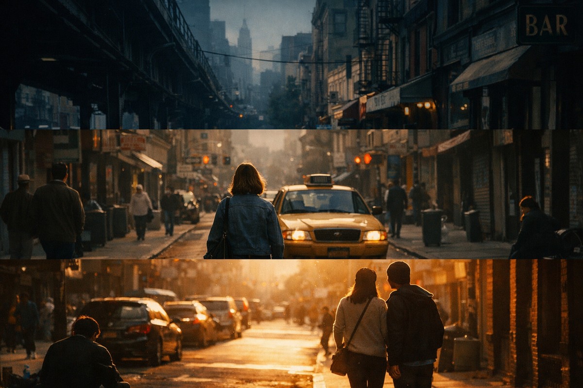
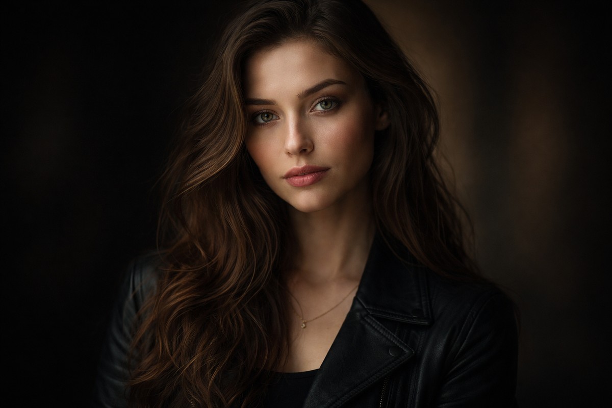
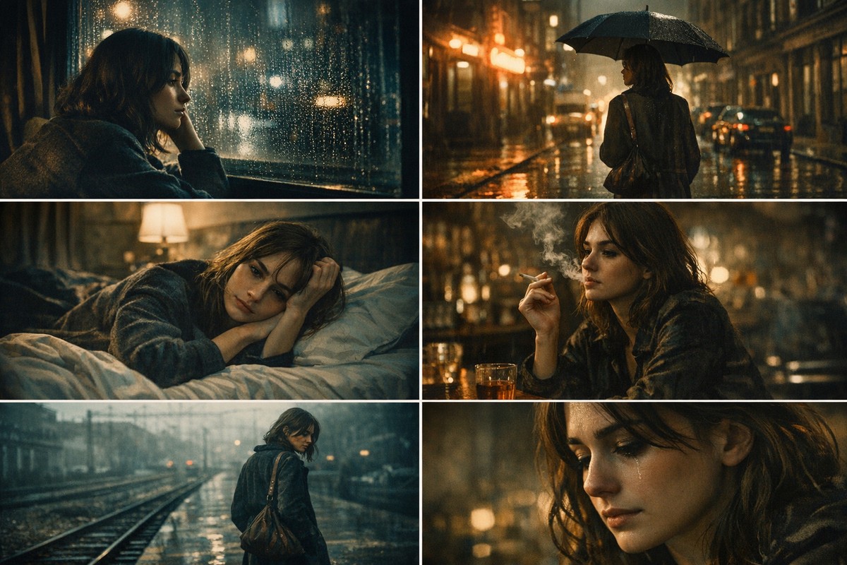
Moody color grading is one of the most popular editing styles in modern photography. Dark shadows, muted colors, deep greens, soft highlights — this look feels emotional, cinematic, and intentional. But when beginners try to recreate it, the result is often muddy, oversaturated, or simply dark without mood.
This guide shows you how to create moody colors in Lightroom the right way. No shortcuts, no gimmicks — just a clean, repeatable workflow that works for portraits, lifestyle, street, and travel photography.
LIGHTROOM PRESETS
If you want to level up your photo editing and color grading, I’ve put together a page with my favorite presets — the ones that actually work — plus exclusive discounts. Open it in a new tab and save it for later, so you always have a go-to place for reliable tools and inspiration.
START EDITING BETTERWhat “Moody Colors” Really Mean
Before touching sliders, it’s important to understand what moody editing actually is.
Moody colors are not about:
- making the photo dark
- crushing blacks
- desaturating everything
Moody editing is about:
- controlled contrast
- selective color reduction
- emotional color balance
- soft highlights
- deep but detailed shadows
Mood comes from color relationships, not darkness.
Step 1: Start With a Proper Base Edit
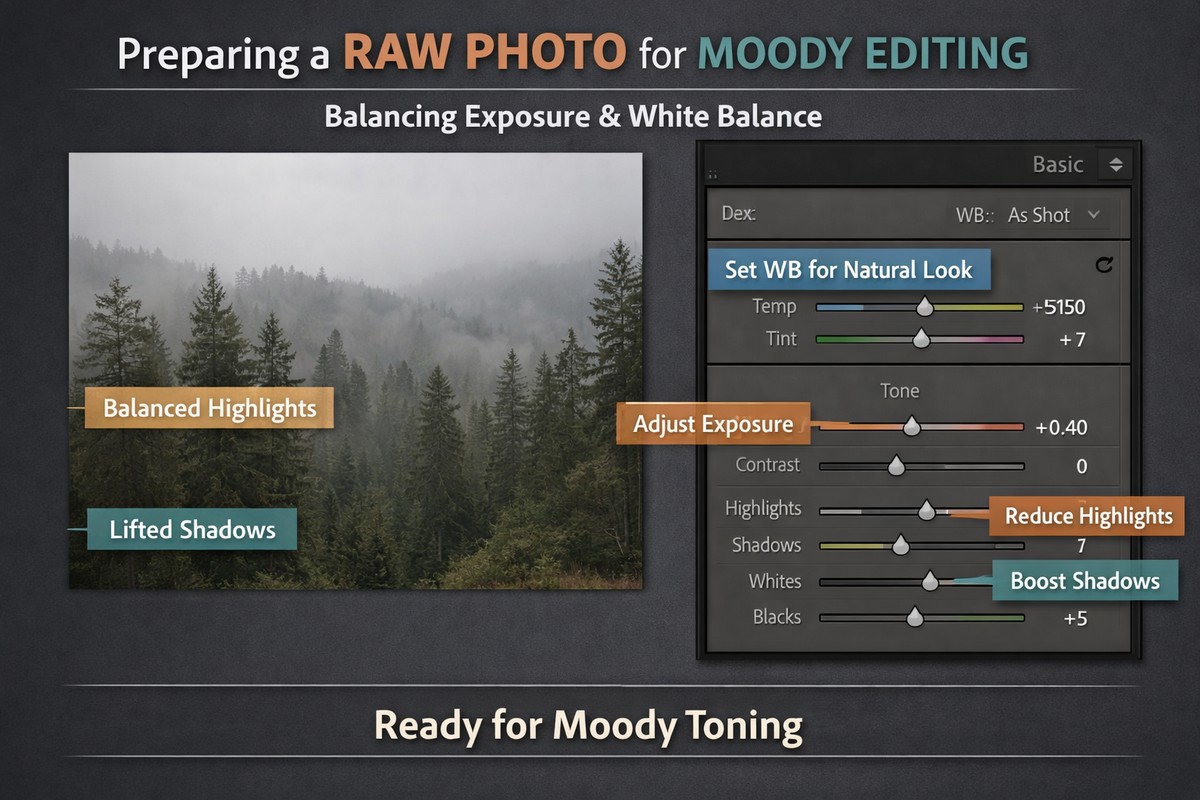
Moody edits fail when the base image is wrong.
Before creating mood:
- fix exposure
- correct white balance
- balance highlights and shadows
- apply lens corrections
A clean base gives you room to shape the mood without breaking the image.
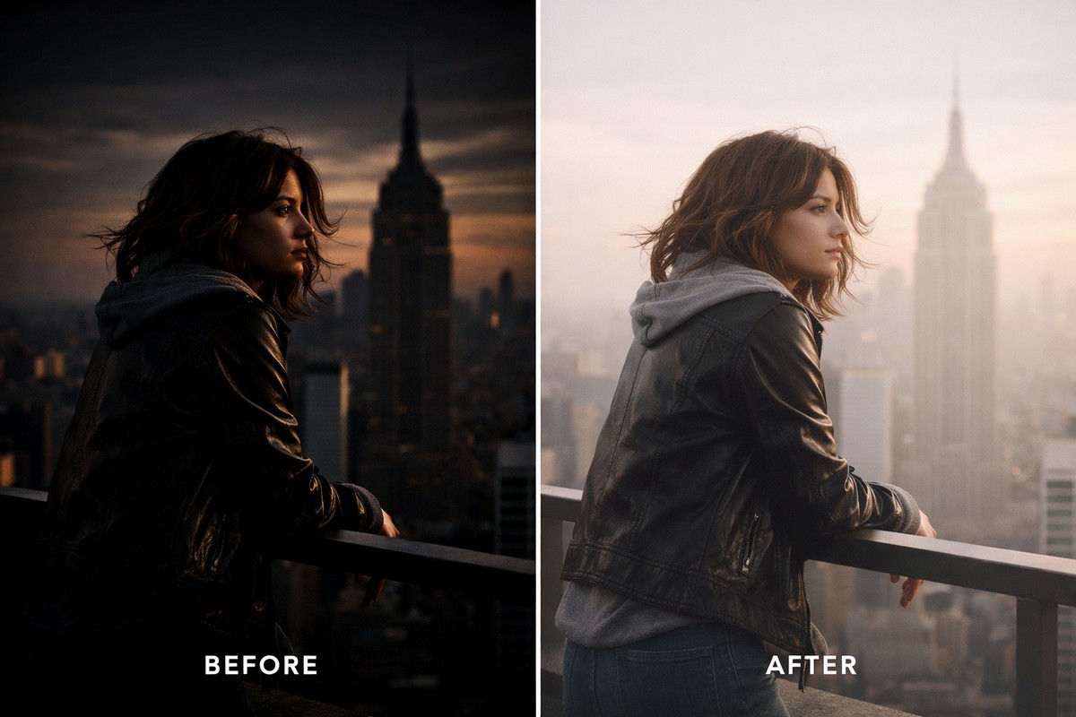
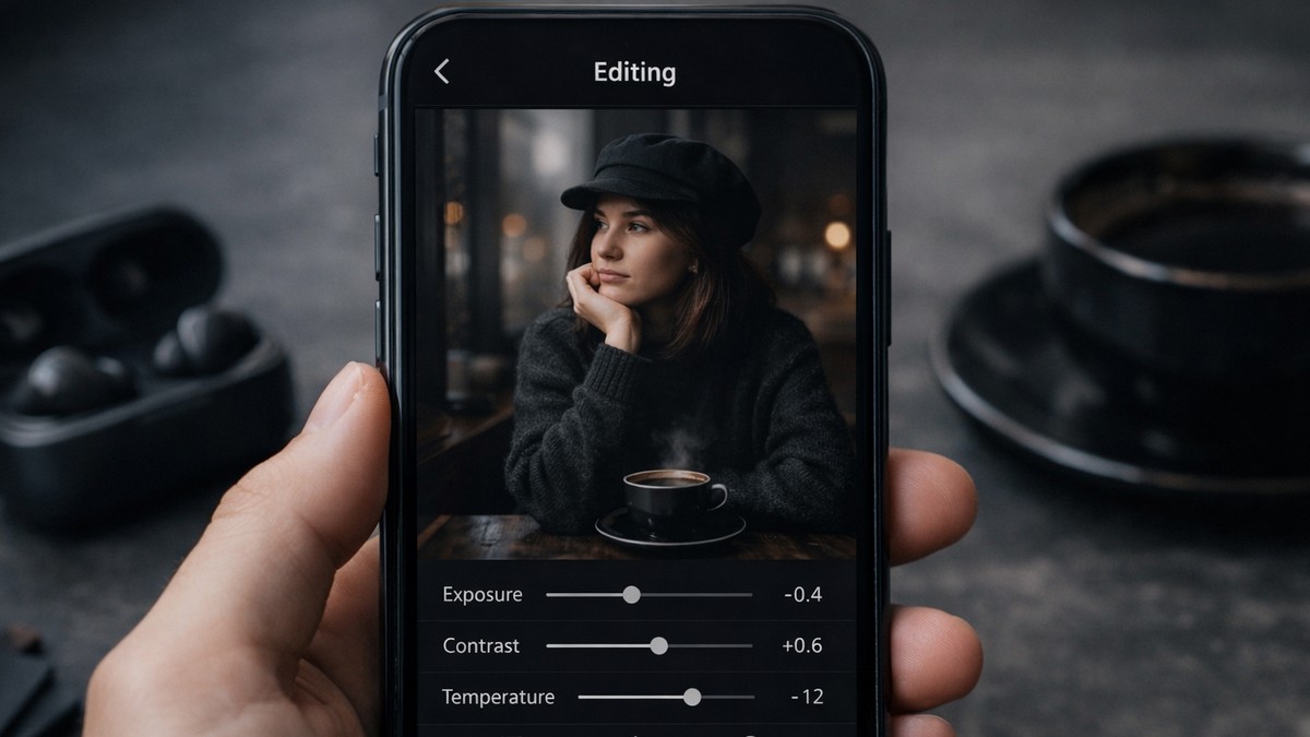
Step 2: Lower Exposure Slightly (But Don’t Kill Detail)
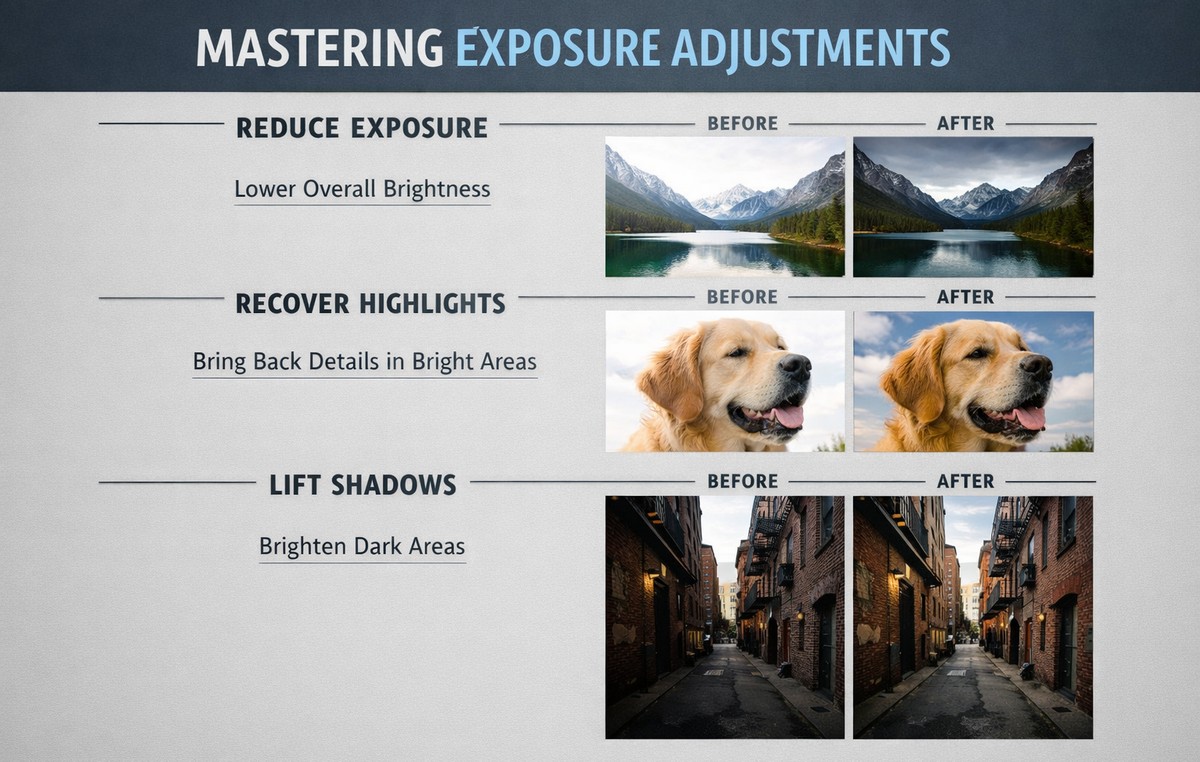
Moody photos are usually darker — but not underexposed.
Typical starting point:
- Exposure: –0.10 to –0.40
Then:
- recover highlights
- lift shadows slightly
You want depth, not lost information.
Step 3: Reduce Overall Saturation (Carefully)
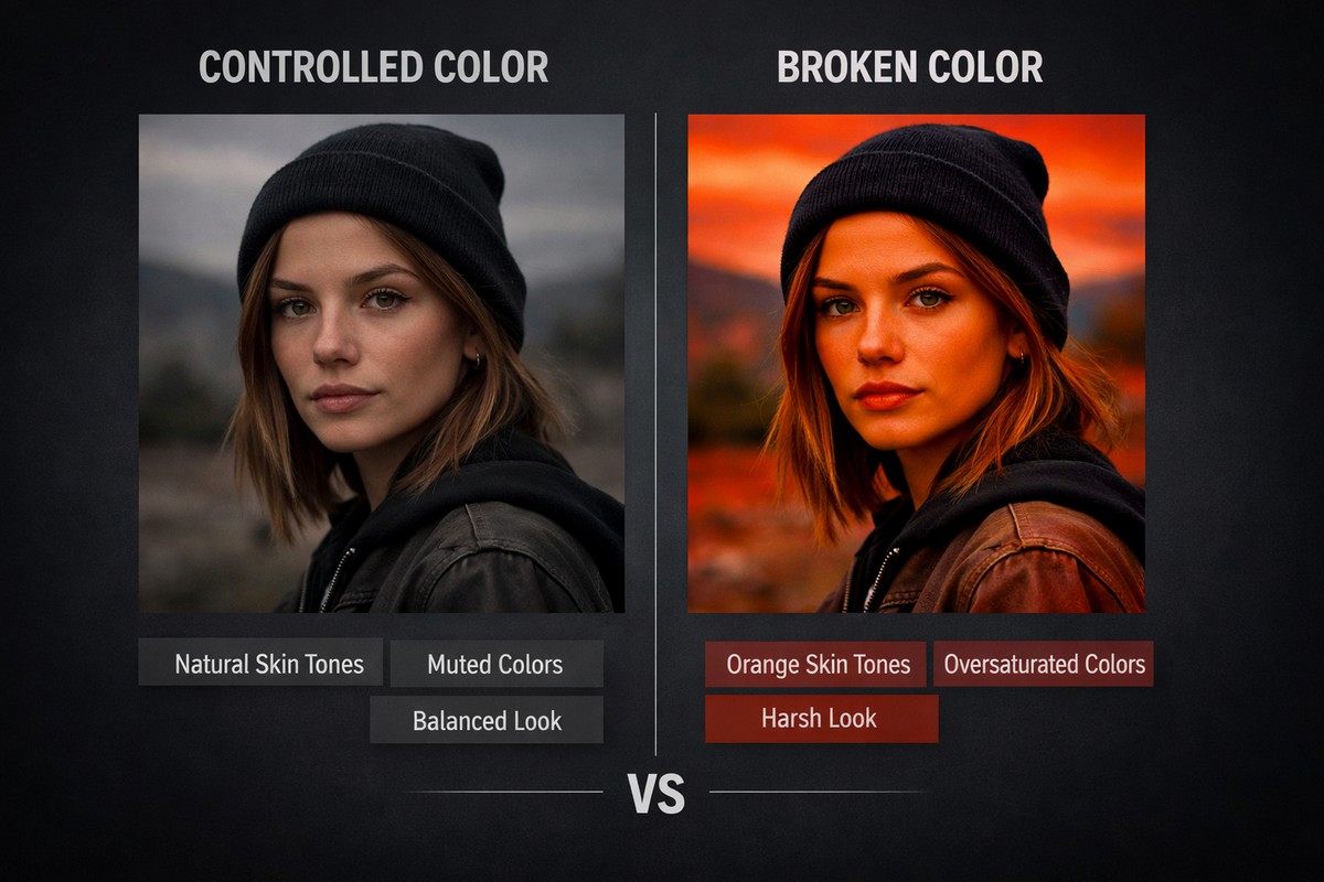
Moody edits rely on restrained color.
Instead of pulling Saturation:
- reduce Vibrance first
- touch Saturation only if needed
This keeps skin tones alive while calming the rest of the colors.
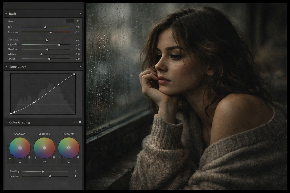
Step 4: Use the Tone Curve to Create Depth
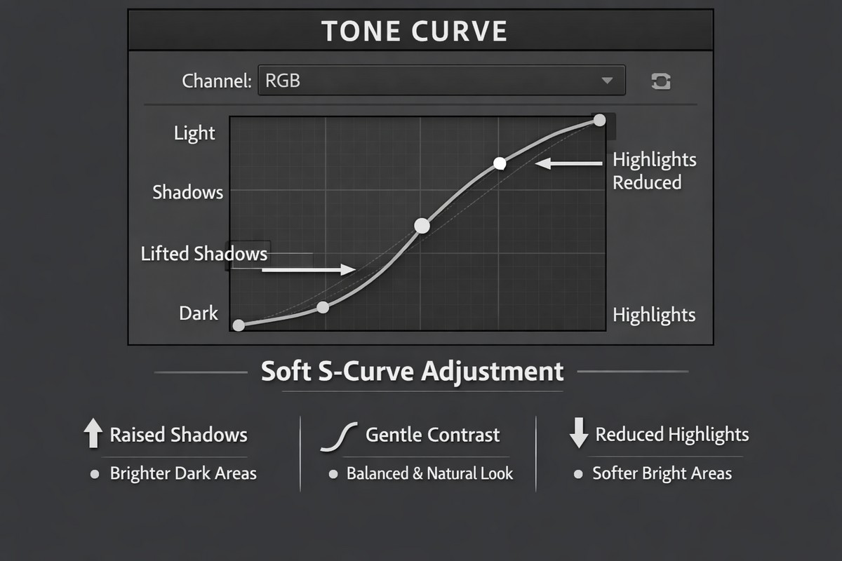
The tone curve is the backbone of moody color grading.
Basic Moody Curve
- slight S-curve
- lift shadows a bit
- gently lower highlights
This creates contrast while keeping the image soft and cinematic.
LIGHTROOM PRESETS
If you want to level up your photo editing and color grading, I’ve put together a page with my favorite presets — the ones that actually work — plus exclusive discounts. Open it in a new tab and save it for later, so you always have a go-to place for reliable tools and inspiration.
START EDITING BETTERAvoid extreme curves — they flatten images quickly.
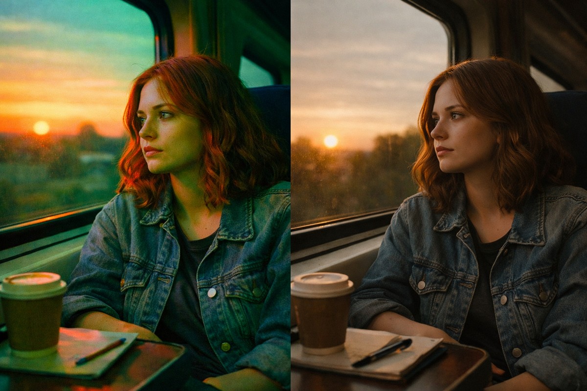
Step 5: Darken Greens and Blues With HSL
Most moody looks rely heavily on greens and blues.
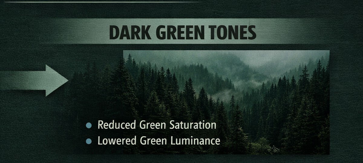
In the Color Mixer:
- lower green luminance
- slightly desaturate greens
- shift green hue toward yellow or teal
- darken blue luminance for skies
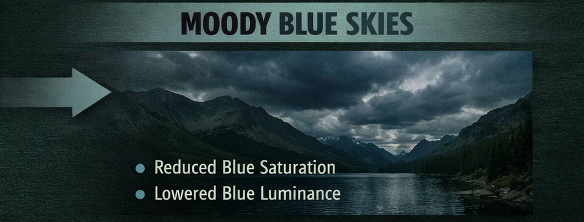
This creates depth and atmosphere without killing color.
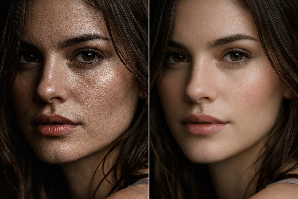
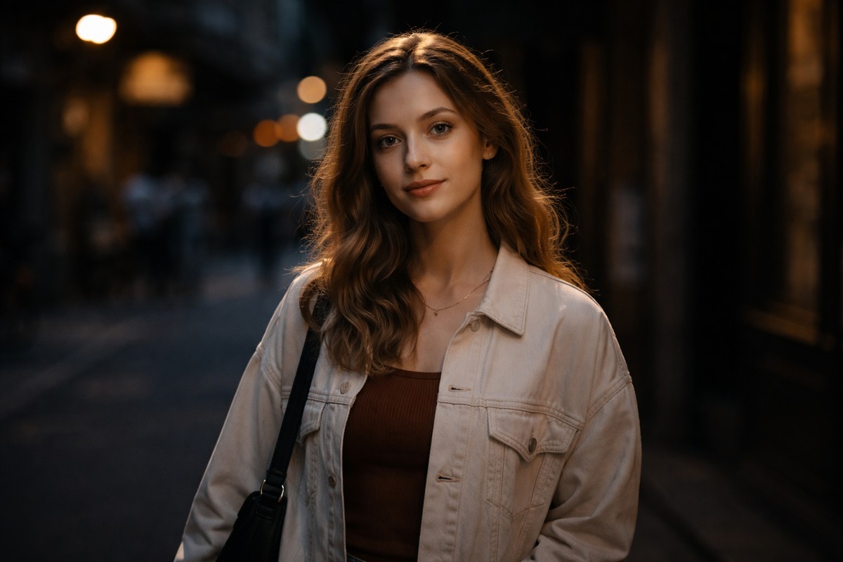
Step 6: Control Skin Tones Separately
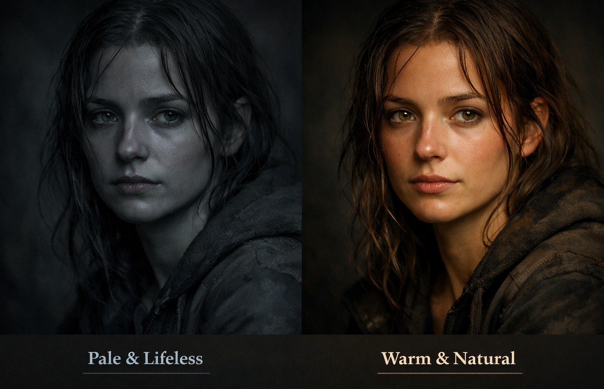
Moody edits often fail on skin.
Skin should:
- stay warm
- stay readable
- not turn gray or orange
In the orange channel:
- reduce saturation slightly
- increase luminance gently
- shift hue minimally
If skin looks wrong, fix it before anything else.
Step 7: Use Color Grading for Cinematic Balance
Color Grading (three-way wheels) is where mood comes alive.
Common moody setup:
- Shadows: cool (blue/teal/green)
- Midtones: neutral or slightly warm
- Highlights: warm
Use low saturation values.
Subtle color shifts feel cinematic. Strong ones feel fake.
Step 8: Add a Soft Matte Look (Optional)
A matte look often supports moody color grading.
How to do it:
- lift the black point slightly in the tone curve
- avoid flattening midtones
Matte should soften contrast, not remove it.
Step 9: Reduce Clarity, Use Texture Instead
Clarity often destroys moody edits.
Beginner rule:
- reduce Clarity slightly
- use Texture for fine detail
Moody images should feel soft, not crunchy.
Step 10: Use Masks to Shape the Mood
Global edits alone rarely create strong mood.
Use masks to:
- darken backgrounds
- brighten subjects slightly
- reduce saturation in shadows
- guide the viewer’s eye
Even small local adjustments dramatically improve mood.
Step 11: Add Subtle Vignetting
Vignetting helps isolate the subject and deepen atmosphere.
Settings:
- Amount: very subtle
- Midpoint: wide
- Feather: high
Vignetting should be invisible — just felt.
Step 12: Grain Can Enhance Mood (If Used Carefully)
Grain adds texture and emotion.
Good grain:
- fine
- subtle
- supports the story
Bad grain:
- heavy
- noisy
- digital-looking
If grain draws attention — remove it.
Step 13: Check Color Balance in Different Lighting
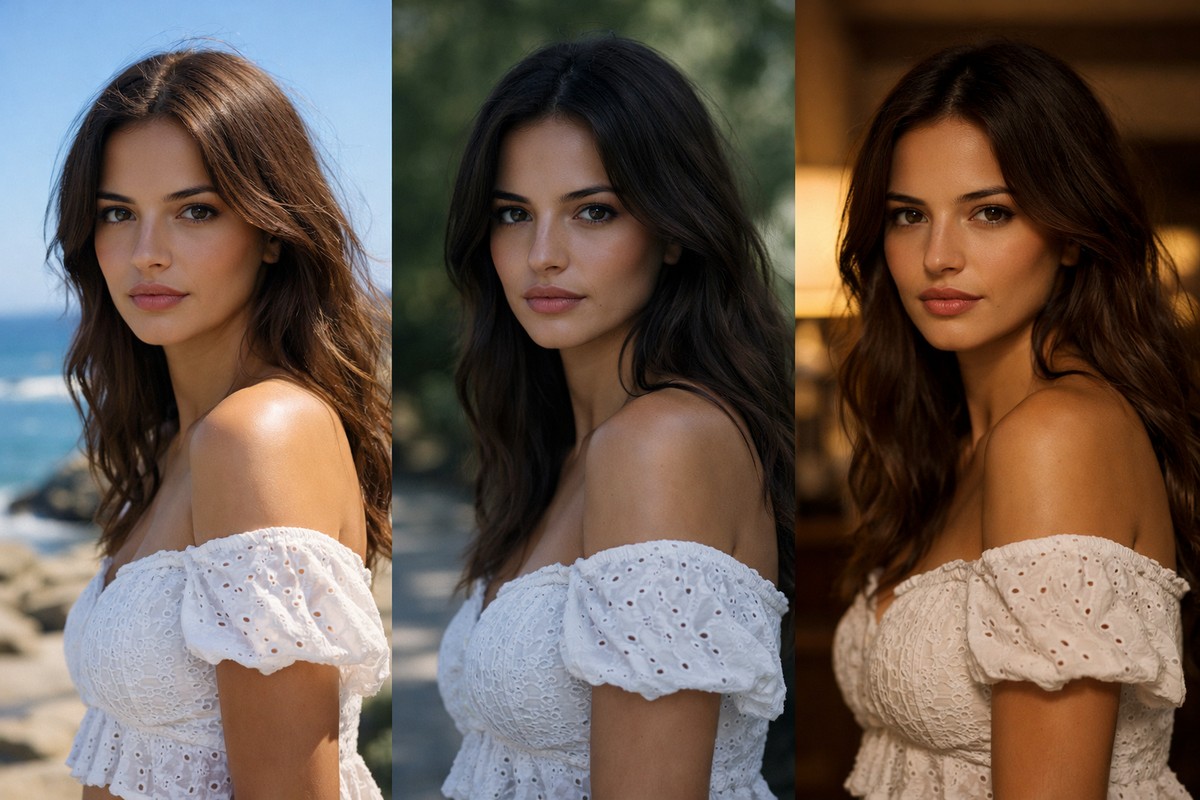
Moody colors behave differently in:
- daylight
- shade
- overcast
- indoor light
Always:
- toggle before/after
- zoom out and step back
- check skin tones
Mood should feel intentional, not accidental.
Step 14: Using Presets for Moody Color Grading
Presets are common starting points for moody edits.
Good moody presets:
- rely on tone curve and HSL
- keep skin tones clean
- are easy to dial back
Bad presets:
- crush blacks
- oversaturate shadows
- break skin tones
Always fine-tune after applying a preset.
Step 15: Moody Colors on Mobile Lightroom
Moody edits work well on mobile — if you stay subtle.
Mobile tips:
- lower exposure slightly
- reduce vibrance
- darken greens
- use color grading lightly
Small screens exaggerate mistakes, so less is more.
Common Mistakes in Moody Color Editing
If your moody edits don’t look right, check for these:
- image too dark, no detail
- skin tones muddy or gray
- oversaturated shadows
- crushed blacks
- too much clarity
- strong color grading saturation
Most issues come from pushing sliders too far.
Moody Colors vs Dark Photos
This distinction matters.
Dark photo:
- underexposed
- lifeless
- low detail
Moody photo:
- controlled darkness
- emotional color balance
- visible texture
- intentional contrast
Mood is crafted, not accidental.
Final Thoughts: Mood Comes From Control
Creating moody colors in Lightroom is not about dramatic moves. It’s about restraint, balance, and intention.
If you focus on:
- controlled exposure
- thoughtful color reduction
- tone curve depth
- careful skin handling
- subtle color grading
…your photos will feel cinematic, emotional, and professional — without looking over-edited.
LIGHTROOM PRESETS
If you want to level up your photo editing and color grading, I’ve put together a page with my favorite presets — the ones that actually work — plus exclusive discounts. Open it in a new tab and save it for later, so you always have a go-to place for reliable tools and inspiration.
START EDITING BETTER