5 Common Lightroom Mistakes (And How to Fix Them)
Lightroom is powerful, but it’s also very easy to misuse. Most photographers don’t struggle because they lack talent — they struggle because they repeat the same editing mistakes over and over again. The result is often photos that look harsh, unnatural, or over-edited, even when the original image was good.
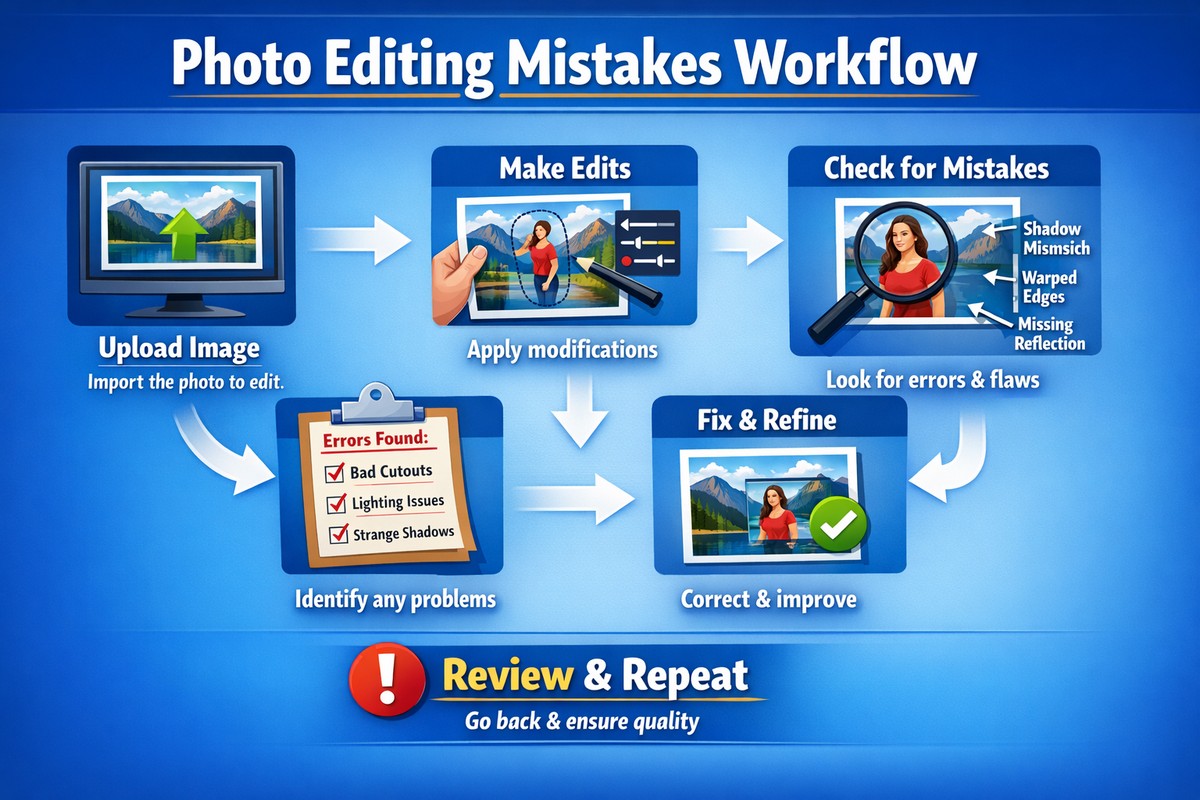
This guide breaks down five common Lightroom mistakes and shows you exactly how to fix them using simple, practical adjustments. No advanced theory, no complicated workflows — just clean corrections that instantly improve your edits.
LIGHTROOM PRESETS
If you want to level up your photo editing and color grading, I’ve put together a page with my favorite presets — the ones that actually work — plus exclusive discounts. Open it in a new tab and save it for later, so you always have a go-to place for reliable tools and inspiration.
TAKE A LOOKMistake #1: Overusing Clarity and Contrast
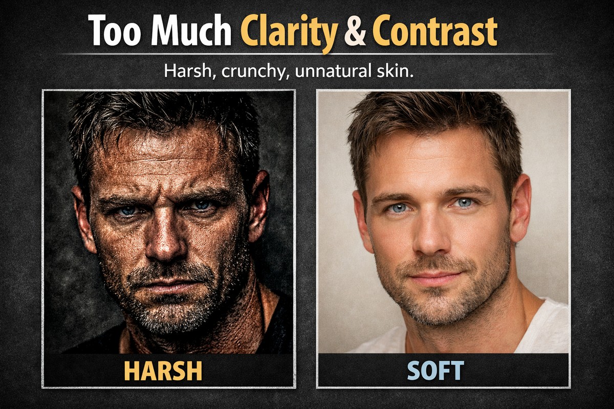
This is the most common Lightroom mistake — by far.
Many beginners believe that stronger contrast and clarity automatically make a photo look more “professional.” In reality, they usually make images look harsh, gritty, and unnatural.
What Goes Wrong
- skin texture becomes rough
- shadows lose detail
- highlights clip too fast
- photos look crunchy instead of clean
Clarity especially exaggerates midtone contrast, which is brutal on portraits and lifestyle shots.
How to Fix It
- reduce Clarity to 0 or slightly negative
- use Texture instead for fine detail
- add contrast using Whites and Blacks, not the Contrast slider
A professional edit feels smooth and controlled, not aggressive.
Mistake #2: Oversaturating Colors
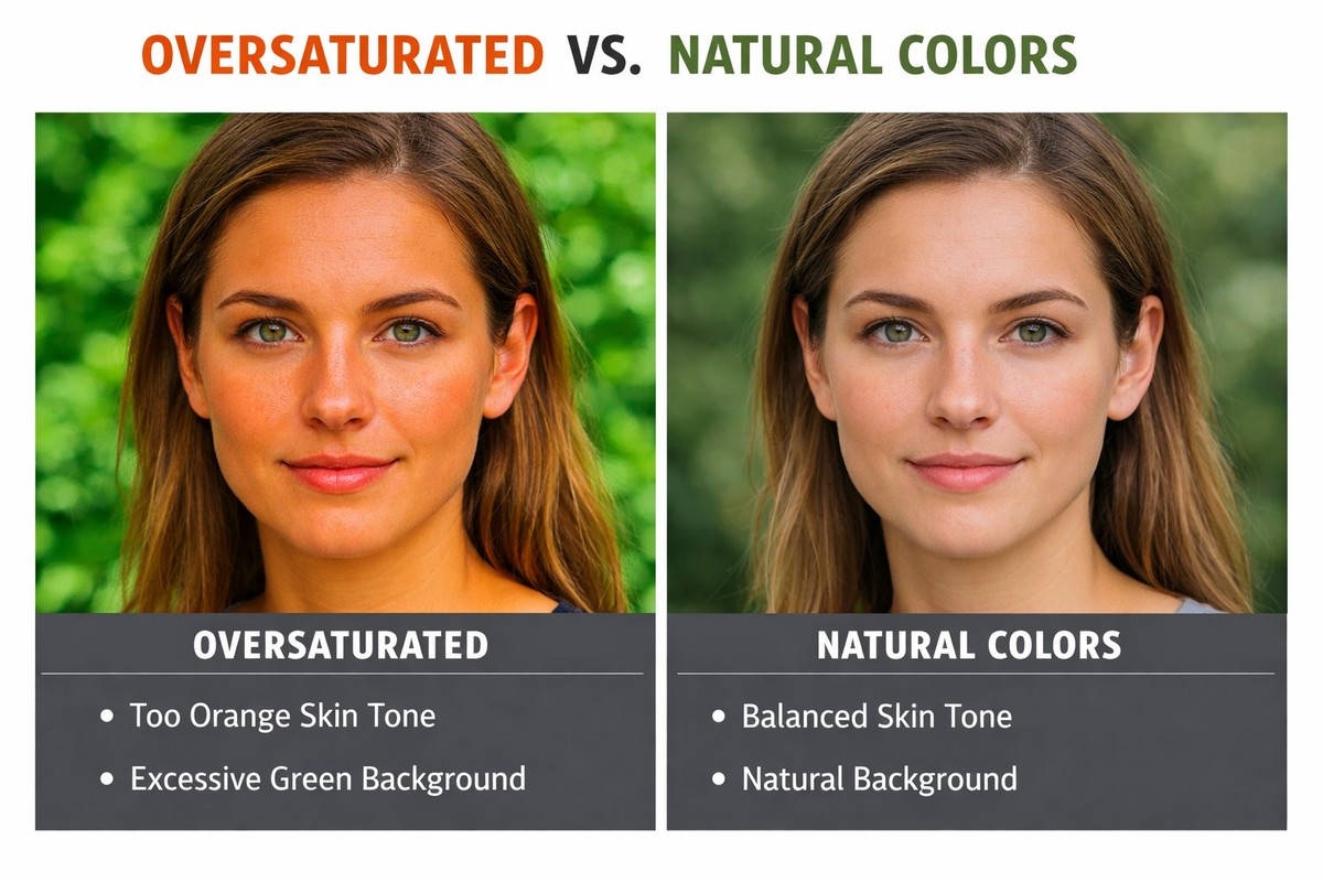
If colors look dull, beginners often push Saturation. That almost always backfires.
What Goes Wrong
- skin turns orange or red
- greens look radioactive
- blues lose detail
- images feel artificial
Oversaturation is one of the fastest ways to make an edit look amateur.
How to Fix It
- use Vibrance instead of Saturation
- reduce saturation selectively in HSL
- focus on balancing colors, not boosting them
In most professional edits, saturation is lower than you think — not higher.
Mistake #3: Ignoring White Balance

White balance mistakes ruin otherwise good edits.
Many photographers leave white balance on Auto and try to “fix” colors later. That rarely works.
What Goes Wrong
- skin tones look sick or unnatural
- photos feel too cold or too warm
- presets behave unpredictably
- colors never feel right
White balance sets the emotional tone of the image.
LIGHTROOM PRESETS
If you want to level up your photo editing and color grading, I’ve put together a page with my favorite presets — the ones that actually work — plus exclusive discounts. Open it in a new tab and save it for later, so you always have a go-to place for reliable tools and inspiration.
TAKE A LOOKHow to Fix It
- adjust white balance early in your workflow
- use the eyedropper on neutral areas
- fine-tune Temperature and Tint manually
If skin tones look wrong, white balance is usually the real issue.
Mistake #4: Applying Presets Without Adjustments
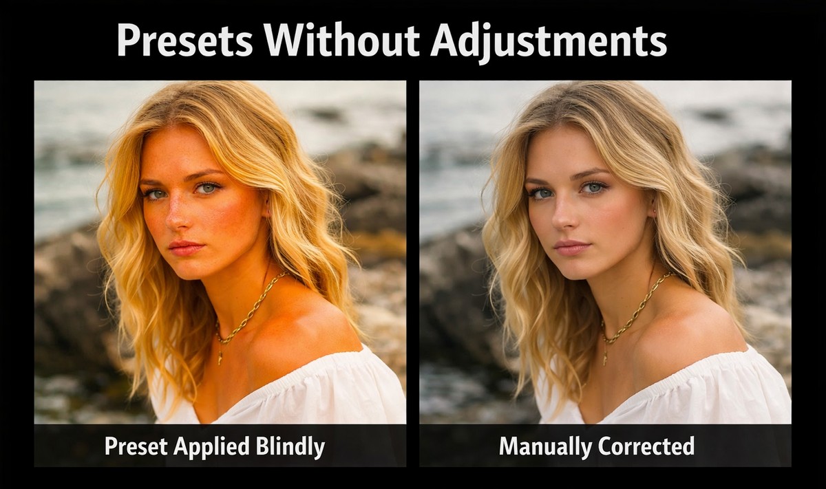
Presets are often blamed for bad edits — but the real problem is how they’re used.
A preset is not meant to be a final result. It’s a starting point.
What Goes Wrong
- exposure is off
- skin tones break
- contrast becomes too strong
- images look inconsistent
Presets react differently to every lighting condition.
How to Fix It
- fix exposure before applying a preset
- adjust white balance after applying it
- reduce preset intensity if needed
- fine-tune skin tones manually
Used correctly, presets save time. Used blindly, they destroy photos.
Mistake #5: Over-Sharpening Everything
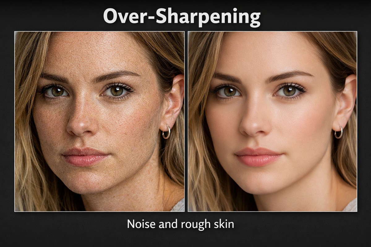
Sharpening mistakes are extremely common — especially with digital and mobile photos.
More sharpening does not mean more detail.
What Goes Wrong
- skin texture looks rough
- noise becomes visible
- edges look harsh
- photos feel overprocessed
Sharpening should enhance detail, not announce itself.
How to Fix It
- lower Sharpening Amount
- increase Masking to protect skin
- sharpen selectively, not globally
Good sharpening is invisible. Bad sharpening is obvious.
Bonus Mistake: Trying to Fix Everything Globally
Many beginners rely only on global sliders.
The problem? Real photos rarely need global fixes.
Why This Matters
- backgrounds and subjects need different treatment
- skin and clothing react differently to contrast
- skies often need separate adjustments
The Fix
Use masking tools:
- Select Subject
- Select Sky
- Brush for small corrections
Local adjustments instantly elevate your edits.
How to Build a Cleaner Lightroom Workflow
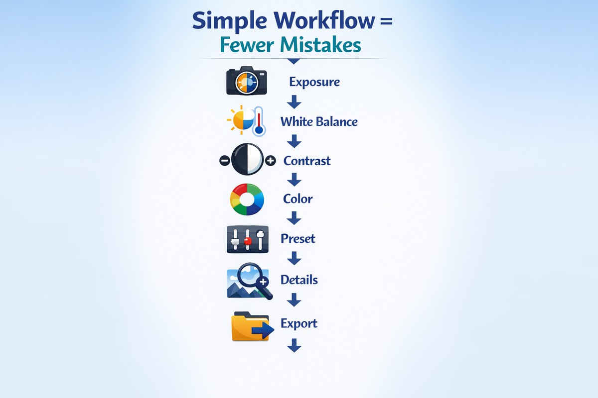
Most mistakes disappear when your workflow is structured.
A simple, reliable order:
- fix exposure
- set white balance
- adjust contrast
- control colors
- apply preset (optional)
- fine-tune details
- sharpen carefully
Consistency beats experimentation every time.
Lightroom Desktop vs Mobile: Same Mistakes, Faster Consequences
On mobile, mistakes show up even faster.
Mobile tips:
- be extra subtle with saturation
- avoid heavy clarity
- skip sharpening unless necessary
- zoom in often to check details
Small screens hide problems that appear later on bigger displays.
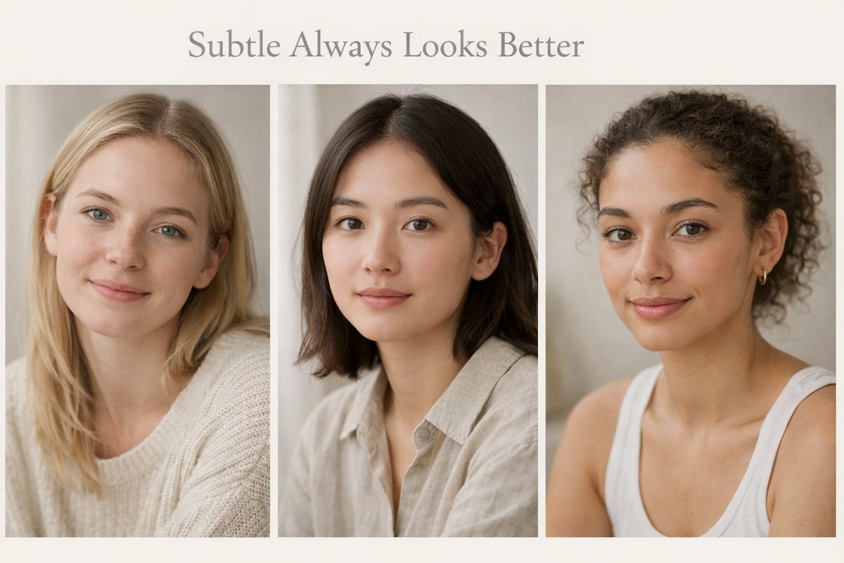
Why Subtle Edits Always Look More Professional
If you compare amateur and professional edits side by side, the difference is rarely technical. It’s restraint.
Professional edits:
- feel balanced
- preserve detail
- keep skin natural
- don’t draw attention to sliders
If viewers notice your editing first — something went wrong.
Final Thoughts: Fixing Mistakes Is Faster Than Learning New Tricks
You don’t need advanced techniques to improve your Lightroom edits. You need to stop repeating the same mistakes.
If you:
- lower clarity
- control saturation
- fix white balance early
- use presets intelligently
- sharpen with restraint
…your photos will instantly look cleaner, more natural, and more professional.
LIGHTROOM PRESETS
If you want to level up your photo editing and color grading, I’ve put together a page with my favorite presets — the ones that actually work — plus exclusive discounts. Open it in a new tab and save it for later, so you always have a go-to place for reliable tools and inspiration.
TAKE A LOOK