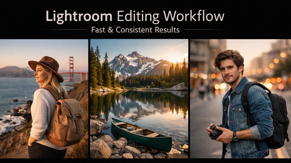
Your Complete Guide to Lightroom Presets for Professional Editing
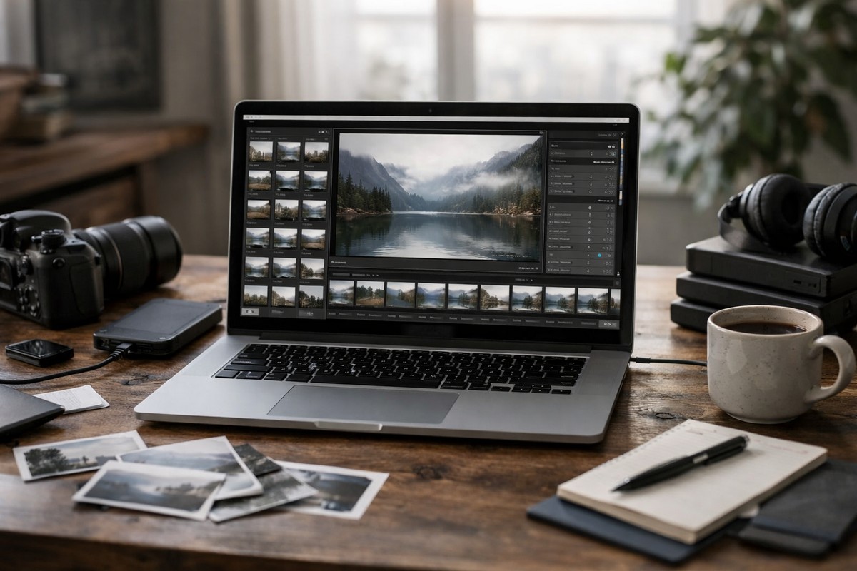
If you’ve ever opened Lightroom, looked at a folder of RAW files, and thought, “This will take forever”, you’re not alone. Every photographer — beginner or professional — eventually reaches a point where manual editing becomes too slow. That’s exactly why Lightroom presets have become essential in modern photography.
But here’s the truth: presets aren’t magic buttons. And buying a huge preset pack won’t fix your workflow if the presets aren’t designed well or don’t match your shooting style. This guide breaks down everything you need to know, from choosing the right presets to understanding how they actually work under the hood.
LIGHTROOM PRESETS
If you want to level up your photo editing and color grading, I’ve put together a page with my favorite presets — the ones that actually work — plus exclusive discounts. Open it in a new tab and save it for later, so you always have a go-to place for reliable tools and inspiration.
TAKE A LOOKWhy Lightroom Presets Matter More Than Ever in 2026
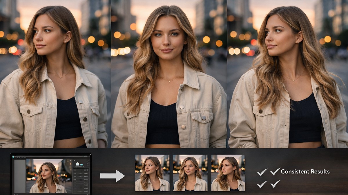
Presets used to be a “nice bonus.” Today they’re part of a standard editing process for creators, influencers, photographers, brands, and agencies. Why? Because digital content demands speed, consistency, and storytelling — all at once.
Here’s why presets are essential now:
• They help you achieve a consistent visual style faster
• They save hours during large client projects
• They reduce decision fatigue during editing
• They make color grading more predictable
• They ensure your Instagram or portfolio looks cohesive
• They help beginners get immediate professional results
Photography isn’t just about capturing the moment anymore — it’s about presenting it.
What Exactly Is a Lightroom Preset?
A Lightroom preset is simply a saved set of editing adjustments. When you apply it, Lightroom instantly changes:
• contrast
• shadows and highlights
• color grading
• tone curves
• saturation by color
• sharpening
• grain
• white balance shifts
• camera calibration
…sometimes even lens corrections and geometry.
A good preset is a carefully built color profile, not just random slider movements.
A bad preset? Oversaturated, over-contrasted, and impossible to adjust.
Types of Lightroom Presets and When to Use Each One
Different shooting conditions require different presets. Below — the main categories that dominate the competitive preset market.
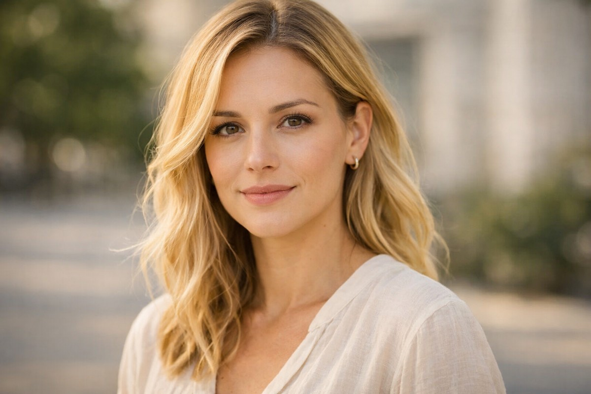
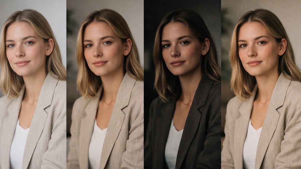
1. Portrait Presets
Portrait presets focus on natural skin tones, warm highlights, and balanced contrast.
Good portrait presets must:
• avoid orange color shifts
• keep skin tones soft and natural
• smooth harsh shadows
• protect highlights on the face
If a portrait preset turns skin pink, red, or yellow — skip it.
Best for: lifestyle shoots, studio photography, influencer content, weddings.
LIGHTROOM PRESETS
If you want to level up your photo editing and color grading, I’ve put together a page with my favorite presets — the ones that actually work — plus exclusive discounts. Open it in a new tab and save it for later, so you always have a go-to place for reliable tools and inspiration.
TAKE A LOOK2. Travel & Landscape Presets
These presets enhance outdoor scenes, sky detail, textures, and dynamic range.
Strong travel presets usually:
• add depth without flattening detail
• enhance greens and blues naturally
• soften harsh sun highlights
• add clarity without noise
Best for: travel creators, bloggers, outdoor photographers.
3. Film-Inspired Presets
Film presets continue to dominate competitive niches because they deliver emotional depth and timeless color.
A solid film preset includes:
• soft contrast
• lifted shadows
• subtle grain
• pastel or muted tones
• warm highlights, cool shadows
Best for: editorial projects, moody storytelling, creative Instagram feeds.
4. Moody & Cinematic Presets
The “moody” look has become a cornerstone of Instagram photography. These presets define atmosphere.
They blend:
• dark greens
• matte blacks
• low saturation
• warm skin tones
• dramatic color separation
Best for: portrait photographers, lifestyle creators, and cinematic storytellers.
5. Clean & Minimal Presets
Used by brands, product photographers, and minimal-lifestyle creators.
These presets are subtle and focus on:
• bright whites
• soft shadows
• neutral tones
• crisp details
A good clean preset looks polished but not sterile.
6. Mobile Lightroom Presets
Mobile presets are specially designed for JPEG/HEIC smartphone images.
They must:
• compensate for limited dynamic range
• avoid extreme contrast
• improve skin tones from phone cameras
• work in mixed lighting
Great mobile presets can transform your feed without needing a desktop workflow.
The Most Popular Lightroom Preset Styles in 2026
Below — the dominant looks users search for in competitive SEO niches.
The “Clean Bright” Look
This style dominates lifestyle blogs and Instagram. Characteristics:
• open shadows
• neutral whites
• soft skin tones
• gentle clarity
It creates a modern, fresh aesthetic.
The “Warm Film” Look (Kodak-Style)
Popular because it adds emotion and nostalgia.
• warm highlights
• slight grain
• soft contrast
• deeper reds
Great for portraits and everyday moments.
The “Tokyo Street” Look (Fuji-Style)
Clean, colorful, crisp.
• cool highlights
• balanced saturation
• natural greens
• modern contrast
Works well in city and lifestyle shots.
The “Dark Moody Green” Look
Still extremely popular.
• desaturated greens
• matte shadows
• strong atmosphere
• soft skin tones
A consistent bestseller across preset creators.
How to Choose the Right Preset (A Practical Framework)
Choosing presets isn’t guesswork — it’s matching editing style to shooting conditions. Use this framework.
Step 1: Identify Your Primary Shooting Light
Natural light? Studio? Nighttime streets?
Presets behave differently depending on highlight/shadow balance.
Step 2: Match Presets to Your Camera Brand
Canon, Sony, Nikon, and Fuji RAW files respond differently to color shifts.
(Sony = cooler, Fuji = unique green tones, Canon = warm reds.)
Step 3: Choose the Style That Matches Your Brand Identity
Ask yourself:
• Do I want warm or cool tones?
• Do I prefer matte or contrasty edits?
• Do I want a bold style or natural look?
• Do I need presets for clients, social media, or personal work?
A consistent-editing style is the foundation of a memorable brand.
The Biggest Mistakes People Make With Presets
Avoid these to get clean, professional results.
Mistake 1: Using One Preset for Everything
Real-world lighting is unpredictable. You need variations.
Mistake 2: Leaving Exposure Untouched
Always fix exposure BEFORE adding a preset.
Mistake 3: Overusing Grain
Grain should support mood — not destroy sharpness.
Mistake 4: Ignoring Skin Tones
If skin tones look unnatural, the edit fails.
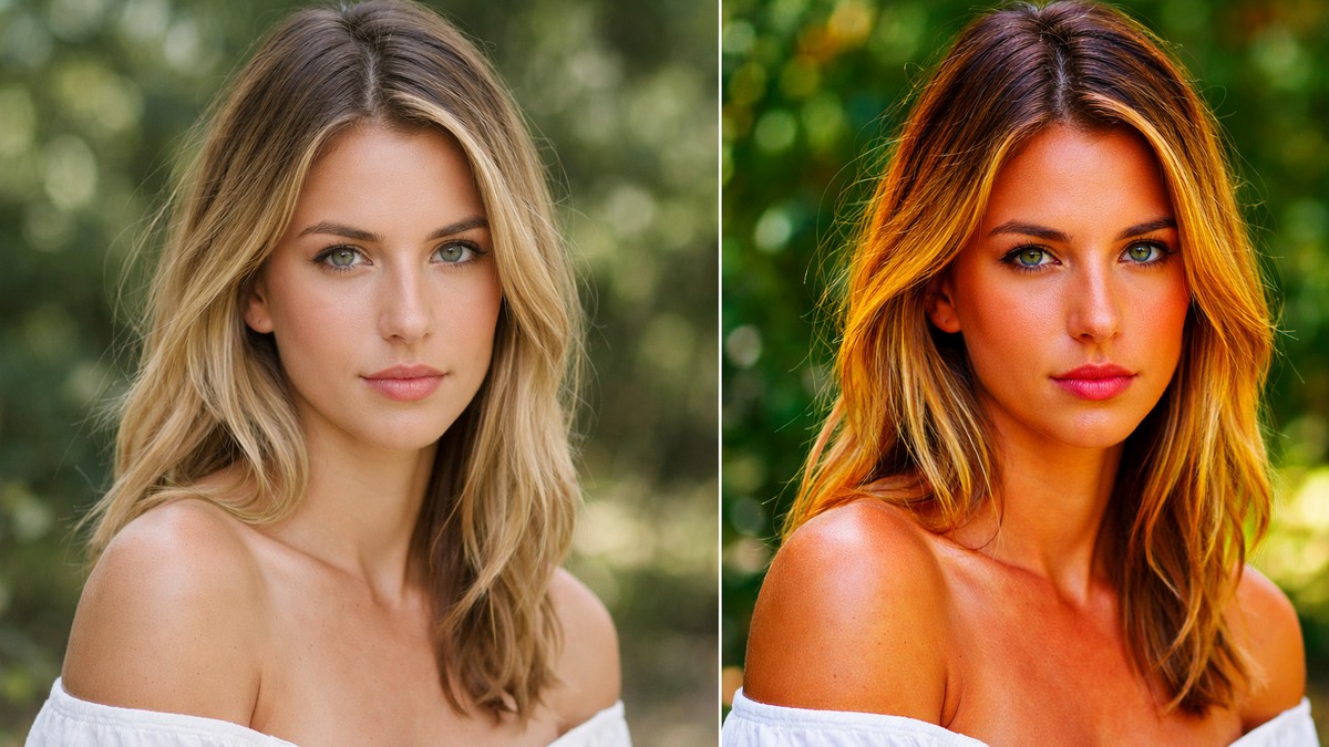
Mistake 5: Turning Saturation Too High
Oversaturation is the number one sign of beginner editing.
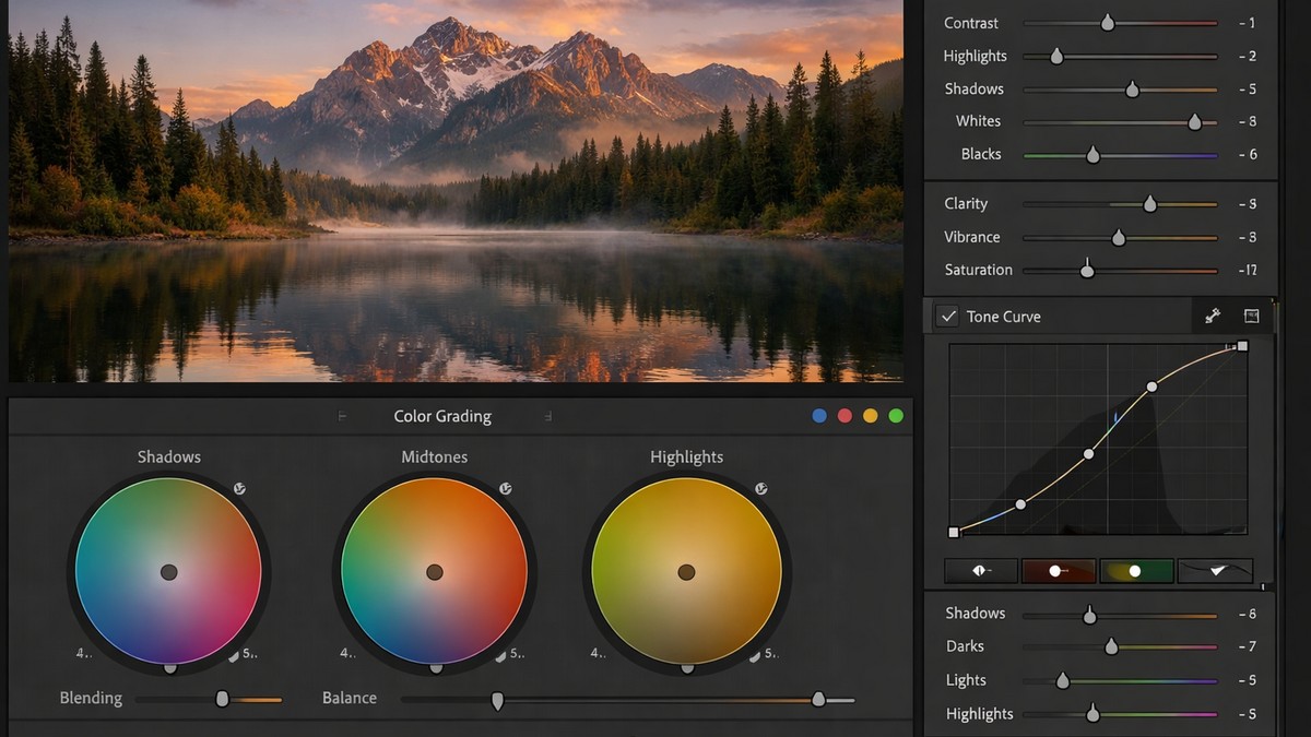
The Technical Side — How Presets Actually Change Color
This part helps you understand how high-quality presets differ from low-quality ones.
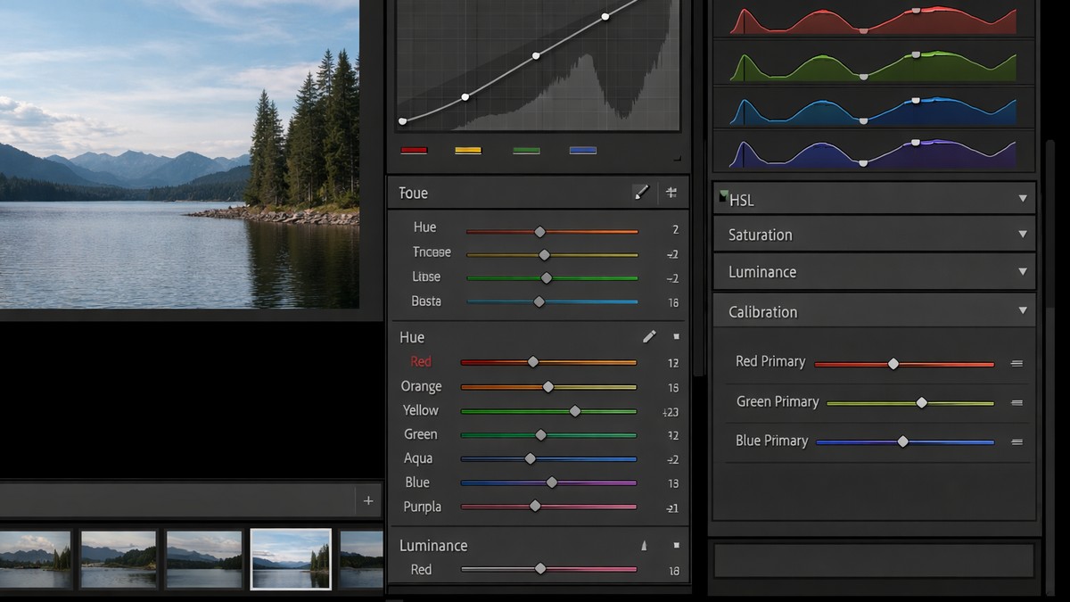
Tone Curve
The tone curve is the backbone of most film and moody presets. It controls:
• shadow depth
• highlight roll-off
• midtone character
A clean tone curve = a clean edit.
HSL (Hue, Saturation, Luminance)
This is where style comes from.
For example:
• warm film presets shift orange hue toward yellow
• moody presets lower green luminance
• clean presets reduce saturation in reds
HSL is the “color personality” of your preset.
Calibration
One of the most powerful, underrated tools.
High-end presets rely heavily on calibration shifts to create unique color palettes.
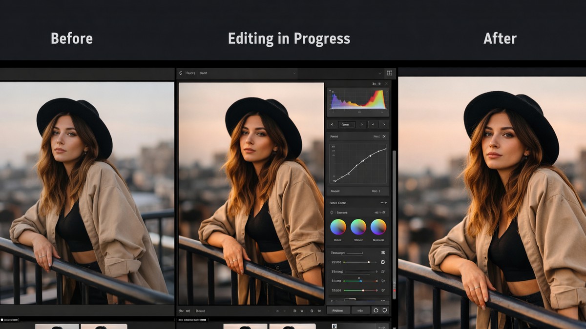
How to Use Presets Properly (Step-by-Step)
Whether you’re editing on desktop or mobile, follow this workflow.
Step 1: Fix Exposure
It determines how the preset behaves.
Step 2: Apply the Preset
One click — but the real work starts now.
Step 3: Adjust White Balance
This is the difference between “almost right” and “perfect.”
Step 4: Tweak Shadows/Highlights
Balance depends on scene lighting.
Step 5: Reduce or Adjust Color Intensity
Especially reds, oranges, and greens.
Step 6: Add Grain Only If Needed
Too much looks fake on digital photos.
Are Free Presets Worth Using?
Yes — for experimenting.
No — for consistency.
Free presets typically:
• use harsh curves
• oversaturate colors
• break skin tones
• lack variations
• don’t match different lighting scenarios
Professional presets are consistent and predictable.
The Future of Lightroom Presets (2026 and Beyond)
Presets are evolving fast. Here’s what’s coming:
AI-Driven Preset Adaptation
Presets that adjust automatically depending on:
• camera profile
• lighting
• tone distribution
Style Matching Across Galleries
Batch editing where 200 photos match the tone of 1 reference shot.
Mobile-First Preset Packs
Creators are editing more on phones than desktops.
Cross-Platform Color Consistency
Ensuring the same look on iPhone, Android, PC, and Mac.
Final Thoughts — What Are the Best Lightroom Presets?
The best presets are the ones that:
• match your lighting
• fit your personal style
• are easy to adjust
• look natural even when applied strongly
• include variations
• don’t distort skin or background tones
You don’t need 500 presets.
You need 4 strong ones:
- one clean everyday preset
- one portrait preset
- one moody preset
- one film preset
With these, you cover 95% of real-world photography.
LIGHTROOM PRESETS
If you want to level up your photo editing and color grading, I’ve put together a page with my favorite presets — the ones that actually work — plus exclusive discounts. Open it in a new tab and save it for later, so you always have a go-to place for reliable tools and inspiration.
TAKE A LOOK